
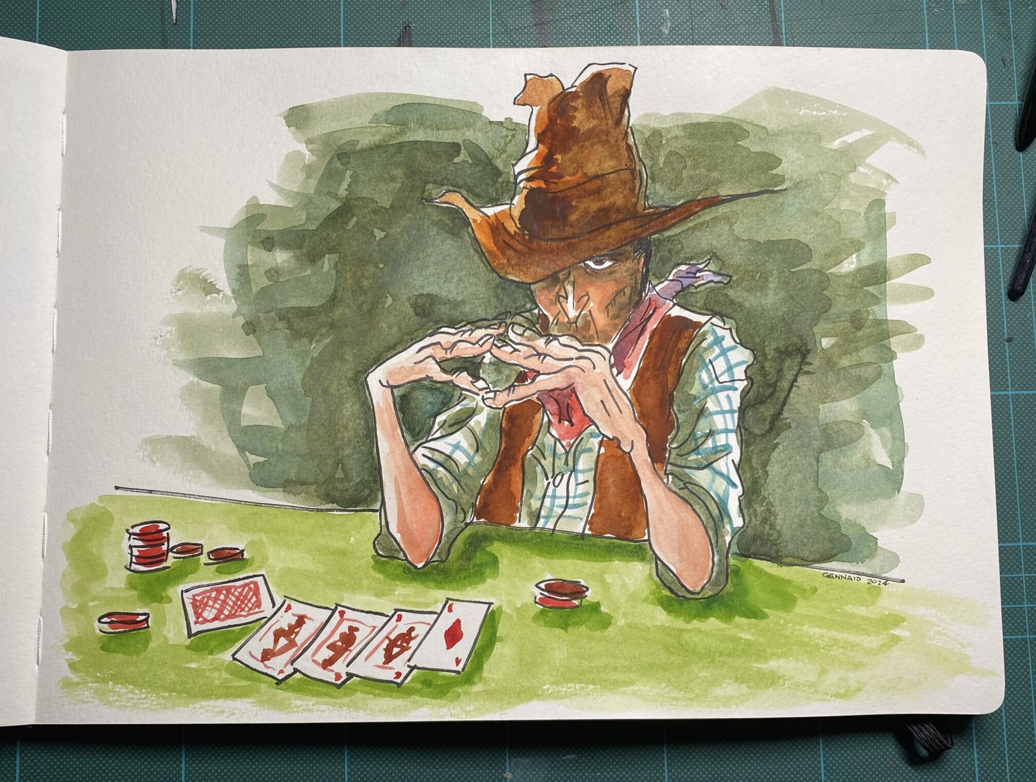
The Poker Playing Cowboy: A Watercolor Character Study
Today I’d like to share my latest character study, based on one of Aaron Blaise’s wonderfully expressive sketches – a crafty cowboy caught in the midst of a poker game. What drew me to this particular piece was how it captures a moment of intense concentration, with just a hint of mischief lurking beneath the brim of that weathered hat.
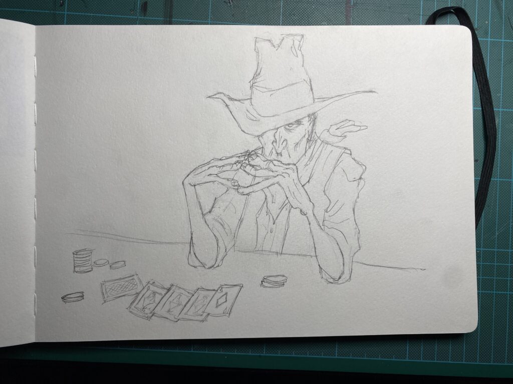
The process began with careful pencil work, mapping out the key elements of this scene. The composition is cleverly arranged, with the cowboy hunched over his cards in classic poker player fashion. His pose tells so much of the story – shoulders hunched, hands gripping his cards close to his face, creating that perfect picture of someone either plotting their next move or trying to maintain their poker face.
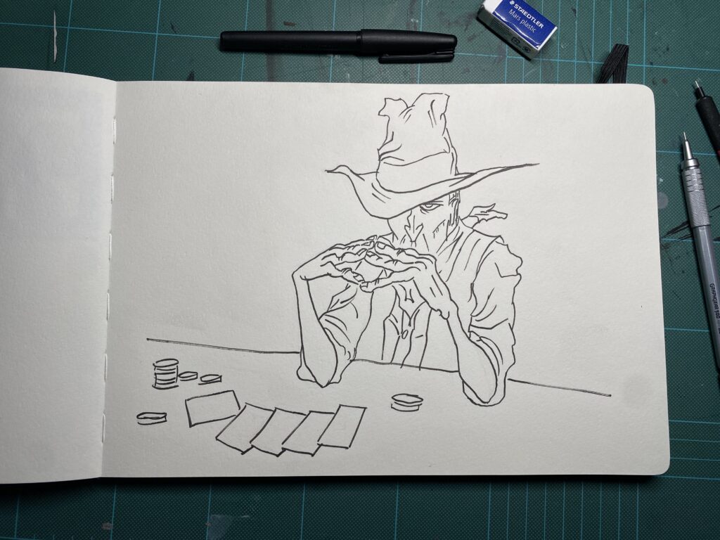
Moving to the fineliner stage required a delicate touch, especially around the facial features. The character’s expression needed to convey that perfect blend of concentration and calculation. Every line in his weathered face, from the sharp nose to the squinting eyes under the hat brim, had to contribute to the story. The checked pattern of his shirt required particular attention to maintain consistency while keeping the loose, sketch-like quality that gives the piece its energy.
But it was the watercolor phase where the character truly came to life. I began with the background, laying down layers of deep forest greens to create depth and atmosphere. The technique here was crucial – allowing each layer to dry partially before adding the next, creating those lovely organic textures that watercolor is famous for.
The cowboy’s costume provided a wonderful opportunity to play with warm earth tones. His hat and vest were painted in rich browns, with subtle variations in the wash to suggest wear and texture. The checked shirt was a delightful challenge – using light blue and white to create that classic Western wear pattern while maintaining the spontaneous feel of the piece.
The poker game elements on the table required precision and a lighter touch. The playing cards needed to be immediately recognizable, with their red backs and face-up diamonds suit clearly visible. The scattered poker chips, painted in bright red, provide perfect accent points that draw the eye around the composition.
What I particularly love about this piece is how it captures a moment in time. There’s a story here – is our cowboy bluffing? Has he just spotted a tell from one of his opponents? Is that the hint of a smile playing at the corner of his mouth? The watercolor medium adds to this storytelling, with its inherent ability to create soft edges and blend colors in ways that feel organic and alive.
The green felted table, suggested with a simple wash of light green, grounds the scene and provides a perfect stage for the drama unfolding above it. The way it fades into the darker background creates depth while keeping the focus on our character and his cards.
Working from Blaise’s design was an incredible learning experience in character expression and storytelling through pose and composition. His ability to capture personality in just a few well-placed lines is legendary in the animation industry, and trying to recreate that effect with watercolor added an extra layer of challenge and discovery.
The finished piece, dated January 2024, now sits in my sketchbook as a study in character, color, and composition. It’s a reminder that great character design isn’t just about how something looks – it’s about capturing a moment, suggesting a story, and inviting the viewer to imagine what might happen next.
This particular character study taught me volumes about patience with watercolors, the importance of leaving whites in the paper, and how to build atmosphere through layers of transparent color. Most importantly, it reinforced the lesson that every element in a piece should contribute to the story you’re trying to tell – from the tilt of a hat to the grip on a playing card.